Big deal, right? Well, Old Me, that's a very math-chauvinist way of thinking. Spending a lot of time with my colleague Aaron Adler at BBN, I've come to appreciate just how important a good user interface is. In fact, I'm coming to think that even just calling it "user interface" is inappropriately dismissive. How we visualize things is how we think about them, and any good AI researcher will tell you that representation is everything.
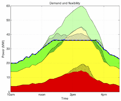
Enough beating around the bush. When we're visualizing how power is getting managed using the ColorPower algorithm I'm working on with Zome, I now show it like this:
There's three classes of power there: green is really flexible, yellow is less flexible, and red is not very flexible at all. We always want to turn off green appliances before yellow appliances and yellow before red. I'm stacking the power on top of each other, so you can see how much is being used by area. Solid colors are currently enabled, pale colors are currently being restricted by the algorithm, in order to meet the goals showed by the black dashed line. The blue line under it (hard to see it's so close!) is how our algorithm is actually performing in simulation. The cross-hatched areas are devices that recently switched on or off and so can't be changed again for a while.
This simulation is a "hot summer day" scenario, when we're being asked to curtail power. The thing to notice here: we're doing damned well!
Now, here's the old visualization:
Horrible, ain't it? Even I have a hard time telling what's going on, and I wrote the thing! I rest my case, and thanks to Aaron for his suggestions and also to Kyle Usbeck for being my independent test subject.


No comments:
Post a Comment